Hired's First-Time-User Onboarding Experience Redesign
Redesigned onboarding experience and dashboard to help first-time-users employers self-onboard and to increase the user’s retention rate.
Overview
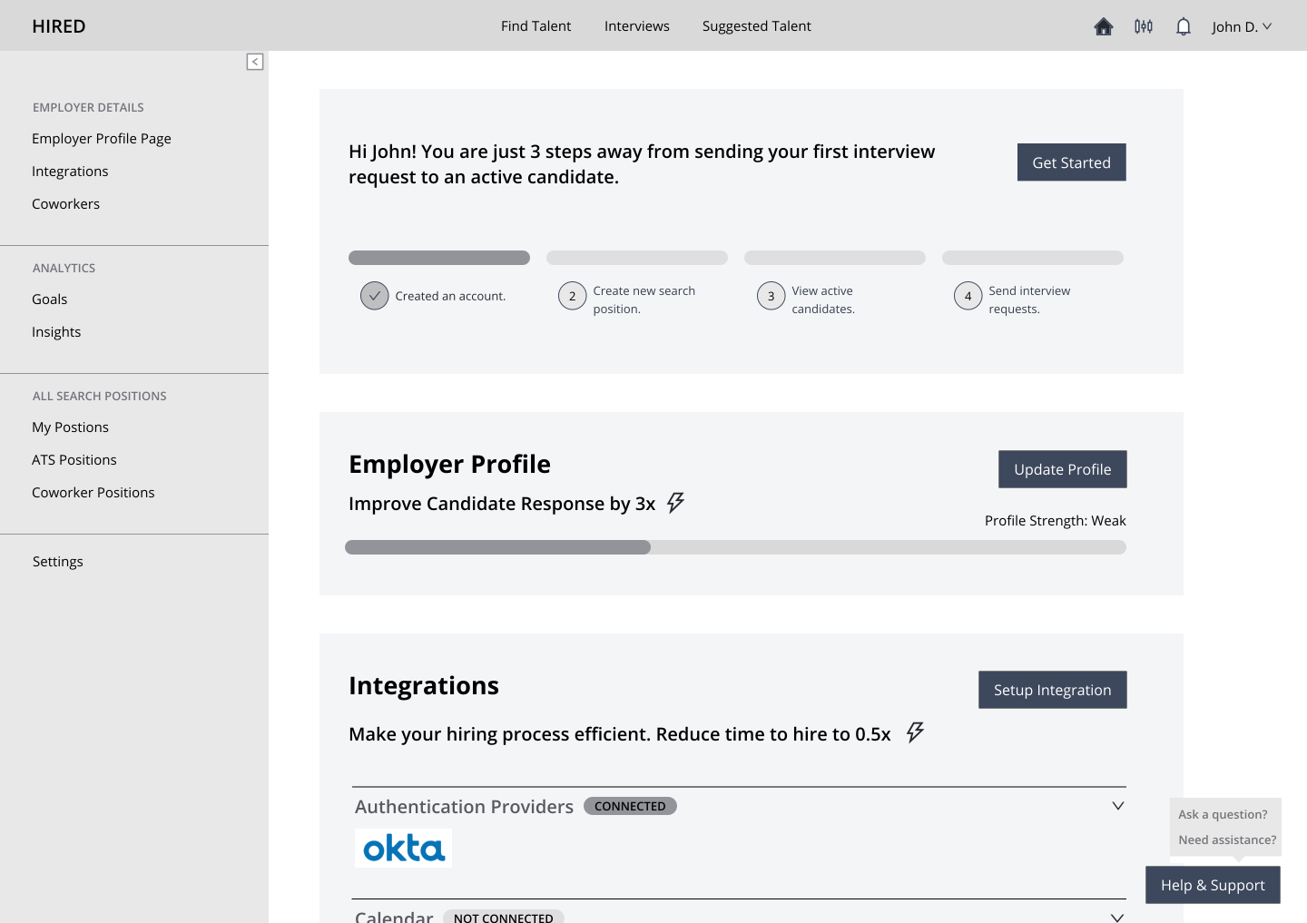
Hired is a job-matching platform that helps employers find relevant job-seekers. Hired Inc. is an online marketplace platform focused on matching job-seekers to best job opportunities. The first-time-user employer found it difficult to self-onboard on the Hired’s platform and find relevant matching active candidates as per their recruiting requirement. I redesigned the first-time user employer’s onboarding experience with intuitive onboarding flow and employer dashboard.
My Contribution
UX Research, Dashboard Redesign and Onboarding Design for first-time-user employer
The Outcome
The new onboarding and dashboard design was targetted to
- Reduce the customer support team's workload for onboarding users by 50%
- Reduce the time to find first matching candidate by 74.3%
thereby increasing the customer (employers) conversion rate.
The Problem
I collaborated with Product manager to conduct research to understand the problems of the first-time-user employer and reasons behind their high drop-off rates from free trial accounts to paid subscription.
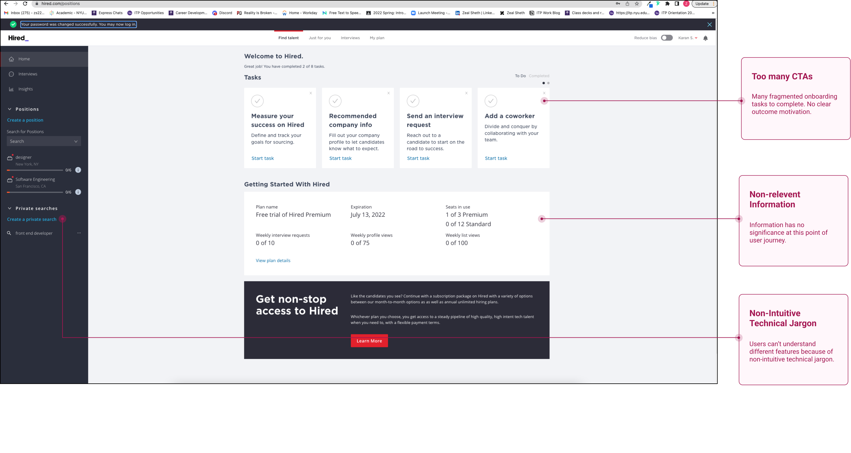
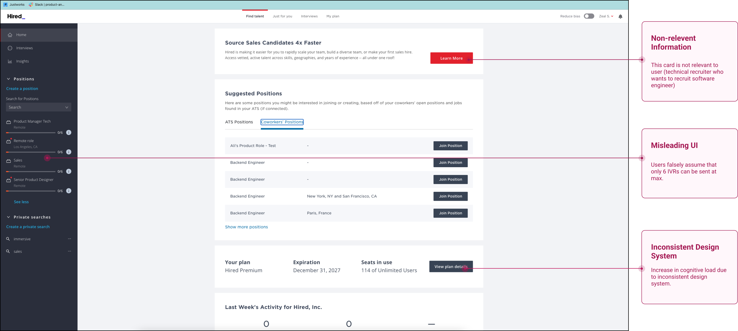
Based on the research insights from UX audits, 8 internal stakeholder interviews, SQL data, click-through-rates, field research insights from customer management teams, I identified the following key user pain points:
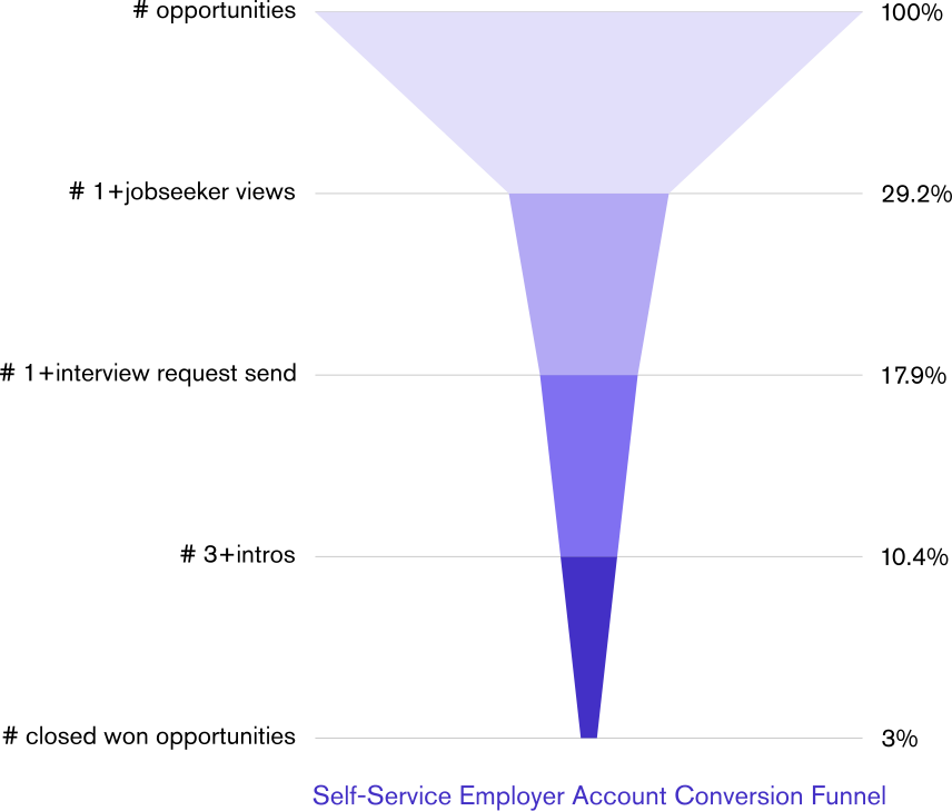
Only 3% of the first-time-user employers self-service accounts were getting converted from free trial to paid subscription.
Design Process
1. Competitive Audit
For ideating a competent solution, I audited 7 job recruiting platforms and 8+ apps with best onboarding practices.
2. Dashboard Redesign Iterations
Team Feedback
- ✅ What works: greater clarity and visibility of the dashboard.
- ‼️ Risks: lack of direction as to what is most important
- 💭 Open Questions: focus on the clarity of the sidebar or the clarity of the bigger section?
Team Feedback
- ✅ What works: Increased chance of fully filling employer profile.
- ‼️ Risks: Updated sidebar could be confusing/less clarity.
- 💭 Open Questions: Will it be beneficial to restrict the user actions before updating Employer Profile?
Team Feedback
- ✅ What works: Easier access to helper tooltip. Higher chance of sending successful IVR.
- ‼️ Risks: New information architecture may create increased cognitive load for existing users.
- 💭 Open Questions: Minimum changes to move the needle.
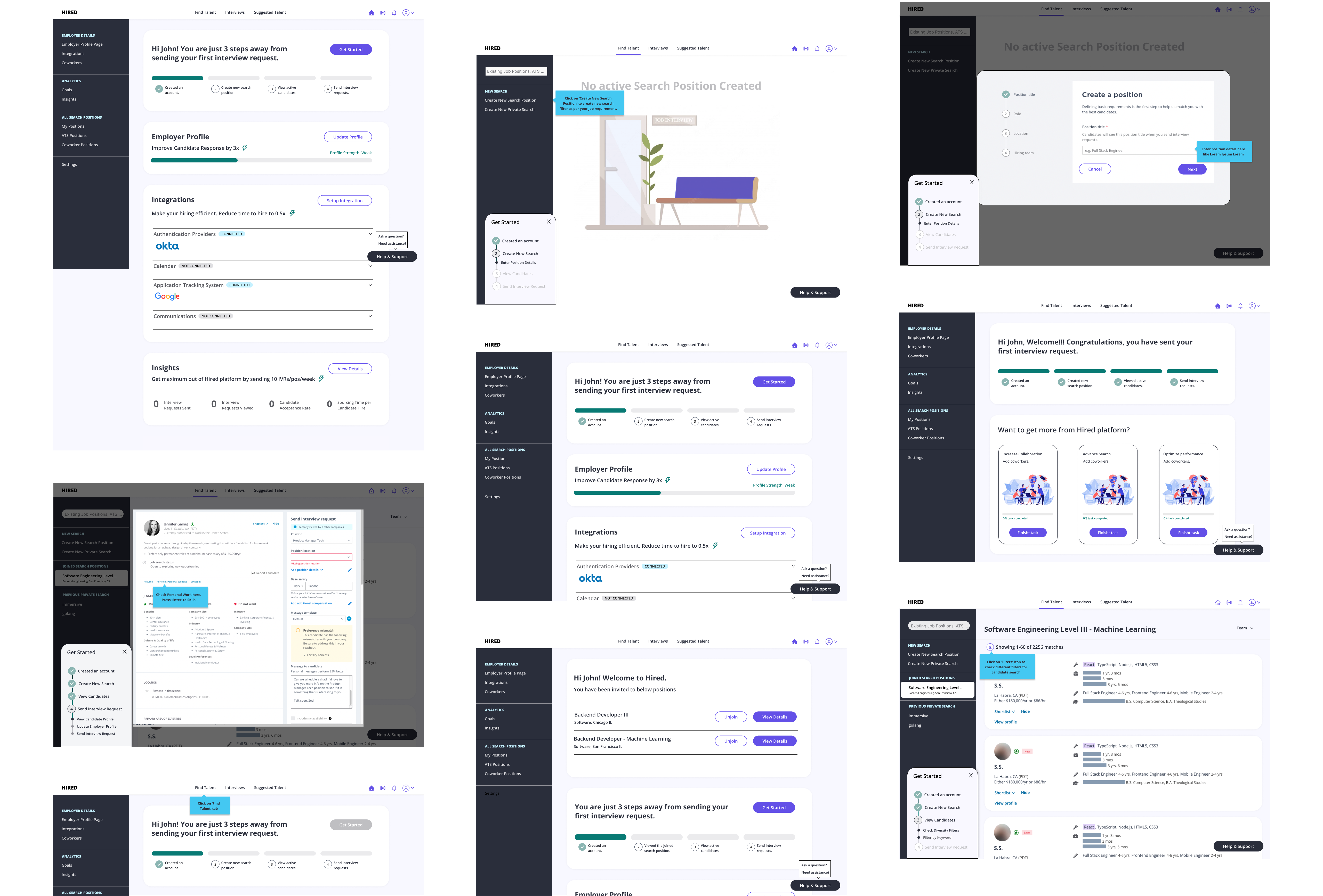
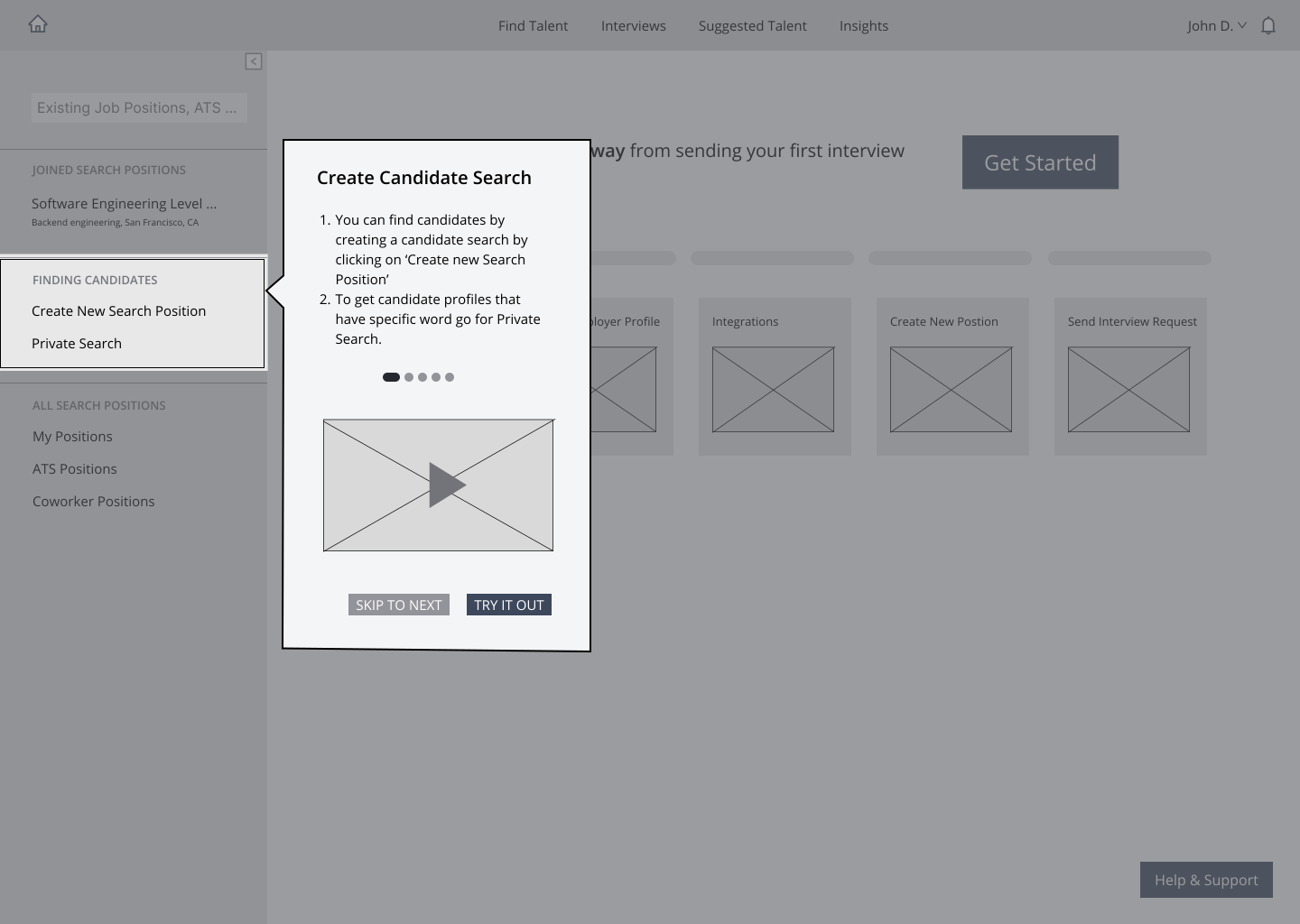
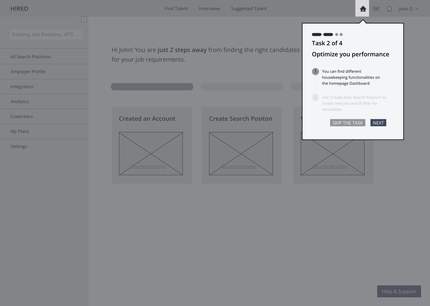
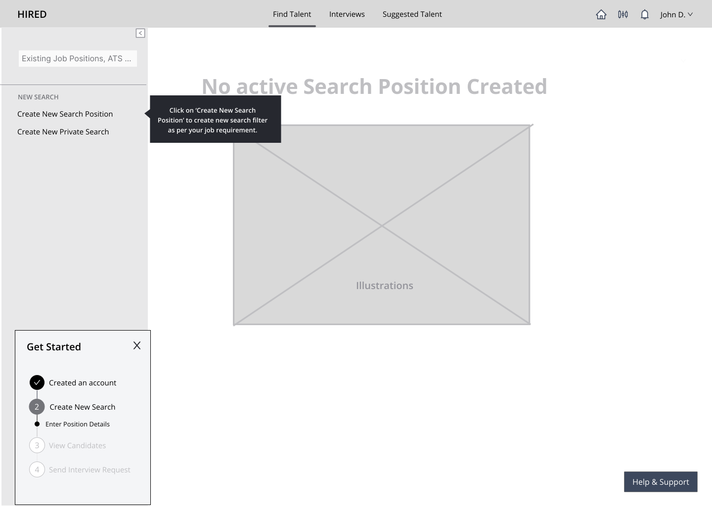
3. Onboarding Design Iterations
Team Feedback
- ✅ What works: Learn by doing approach.
- ‼️ Risks: There is video at someplace and CTA at some other place. Attention competing actions.
- 💭 Open Questions:What if users opt for skip ‘Take a Tour‘?
Team Feedback
- ✅ What works: Walk-through provides more clarity.
- ‼️ Risks: Can be repetitive.
- 💭 Open Questions: Need to get user feedback to decide action feedback.
Team Feedback
- ✅ What works: Walk-through is concise and provides more clarity. Tooltip provision depending upon what actions are finished.
- ‼️ Risks: —
- 💭 Open Questions: —
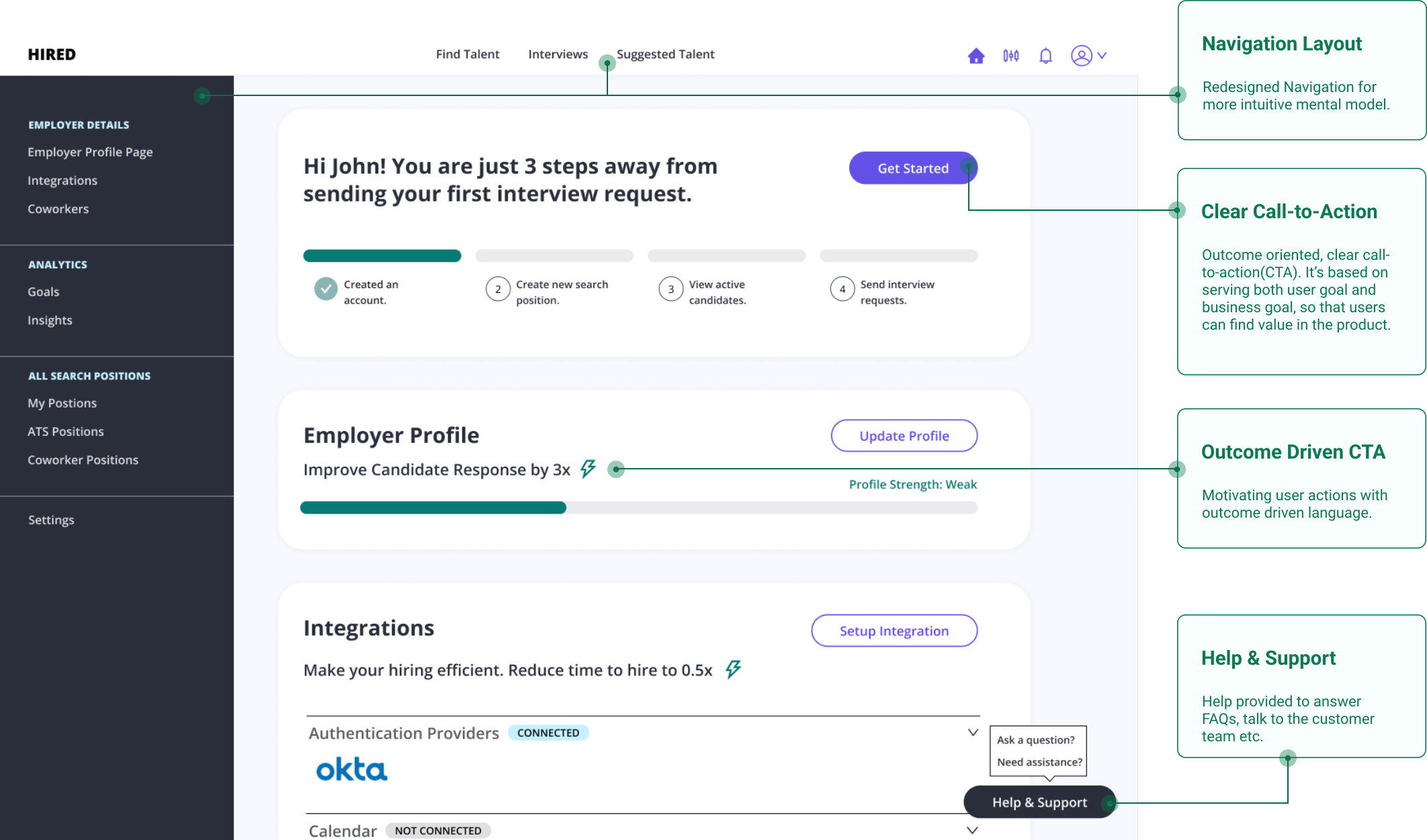
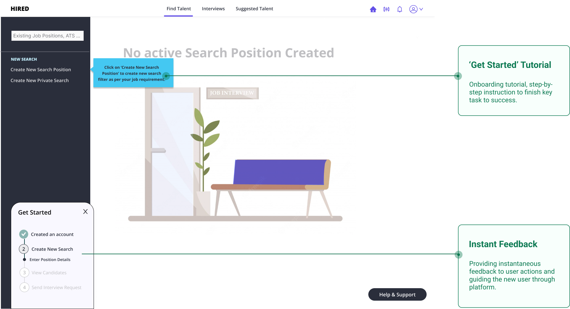
The Solution
Based on feedback on multiple design iterations, I designed final mockup. Below is the Hi-Fidelity solution based on Hired’s Visual Design Experimentations (was still in progress at the time) in collaboration with Visual Designer.
Impact & Learnings
Expected outcome: Increase in the customer (employers) conversion rate because of step-by-step onboarding, clarity in terminology and displaying performance statistics on website to persuade, reduced number of clicks to find active candidates.
My Learnings: Prioritizing design decisions, receiving critical feedback, progressive handoff to the engineering team without breaking the system.