Figma to Coded Design System in under 20 minutes
Make the production ready scalable design system components from the Figma file in under 20 minutes.
Overview
Goal: Reducing design-to-dev debt while scaling design systems.
Process: Leveraging agentic AI like Google Antigravity can bridge the gap between design and development. By connecting Antigravity to the Figma MCP, we can automate the extraction of design tokens directly from Figma files into structured JSON. This workflow enables the AI to generate a three-tier token system - primitive, semantic, and component-specific; ensuring scalability. From there, we can prompt Antigravity to "vibe-code" a Storybook-style preview to document states and behaviors, eventually exporting a production-ready Next.js application.
Impact: Designers can directly contribute to the production-ready design system, maintain single source of truth and reduce the design-to-dev debt.
(I am focusing on using free tools such as Antigravity to ensure this workflow is open to every designer, regardless of budget. You can follow a similar workflow on Cursor or Claude Code too.)
Important Tips
To ensure precision, you can implement specific Logic Rules and Skills:
- Logic Enforcement: If the agent detects a hex code (e.g., #FFFFFF), it must pause and require a token replacement from
src/styles/tokens.json. - Targeted Skills: When running accessibility checks, the agent can be instructed to exclude specific directories, like
/components/ui/, to preserve the visual integrity of core design system components. - Automated Workflows: A "Ship Component" workflow can automate the entire lifecycle, from token extraction to final code.
Step-by-Step Process
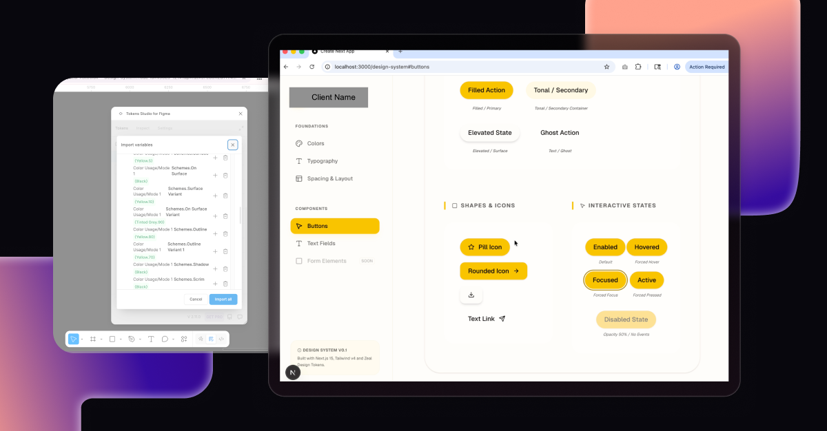
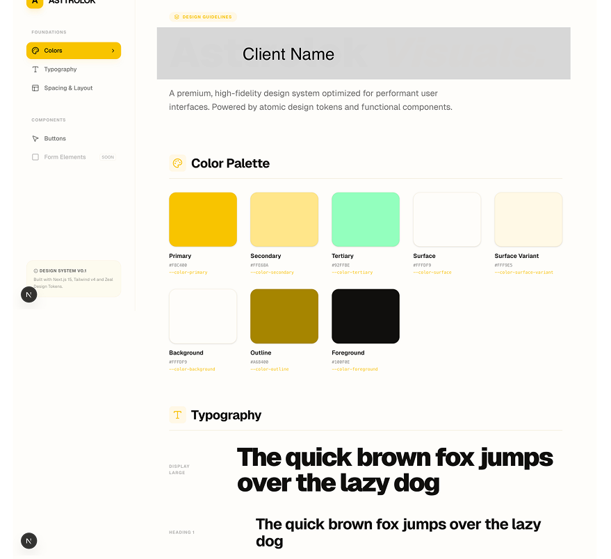
Step 1: Create Design Tokens in Figma
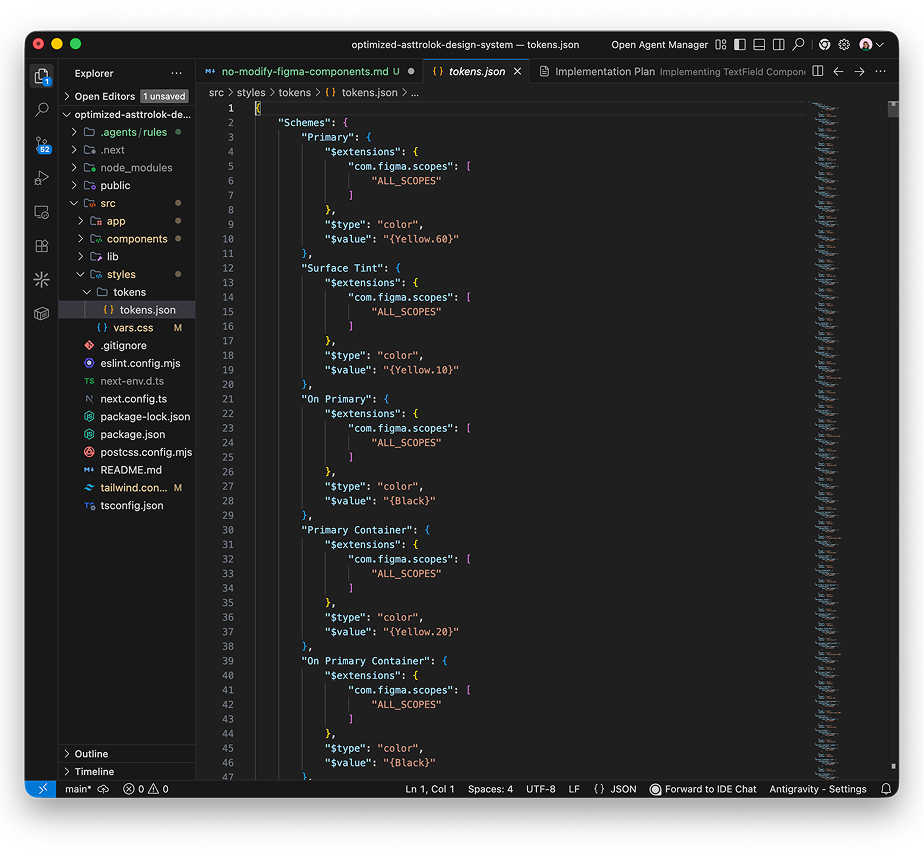
Run free Figma Plugin 'Tokens Studio for Figma' to Export Styles and Colors into tokens.json file
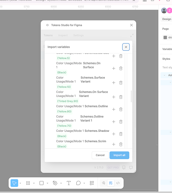
Reduce Design-to-Dev Debt by organizing tokens into 3 levels:
- Global Tokens: Raw values (e.g.,
blue-500: #3b82f6). - Alias/Semantic Tokens: How the color is used (e.g.,
brand-primary: {colors.blue-500}). - Component Tokens: (Optional) Specific to a component (e.g.,
button-bg: {brand-primary}).
Use the "+" icon in the plugin and using curly braces {} to reference other tokens.
Step 2: Connect Antigravity to Figma MCP
Step 3: Generate Storybook-like preview with Antigravity
Prompting Agent to create Coded Design System Interface:
Create a new Next.js project using the App Router, TypeScript, and Tailwind CSS. Ensure the folder structure is optimized for a Design System (e.g. /components/ui, /styles/tokens)
Automated Syncing of Design Tokens:
Copy tokens.json file into /styles/tokens/folder. Give prompt to Google Antigravity Agent "Analyze the tokens.json file. Update the tailwind.config.ts to extend the theme with these specific values for colors, font sizes, and spacing. Create a vars.css file in /styles that maps these tokens t o CSS variables for maximum flexibility"
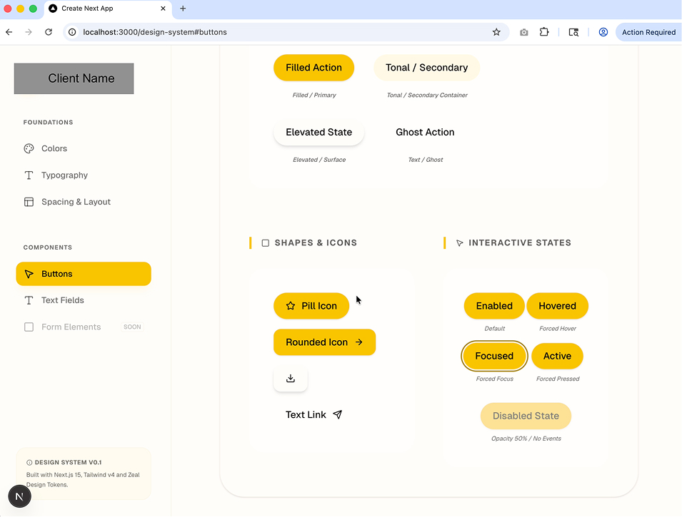
Step 4: Build Components
Prompting Agent to create Components:
"Build a React component for a 'Primary Button' in /components/ui/Button.tsx. Use Next.js 14+ standards and Tailwind CSS. Reference the theme values we just added to the tailwind config. Ensure it is accessible (ARIA labels), supports multiple states (hover, active, disabled), and is responsive. Run a local dev server and use the integrated browser to verify the visual fidelity of the generated components against the Figma design. Create a Storybook-style Preview' page at /design-system to showcase all components."
Step 5: Manual Verification Check
- For accessibility - Visual Readability,
- Component Accuracy - States and Interaction, Visual, Variants
- Webapp Interaction