Instacart's Homepage Redesign
Redesigned Instacart's home page for an intuitive and frictionless experience with AI driven ‘ShopSmart’ feature.
Overview
Instacart is an American grocery delivery and pick-up service in the USA and Canada. During the pandemic the online ordering behavior increased drastically. Instacart tried to capitalize the opportunity with new delivery models and ad campaigns. But when I used website, I found it exhausting. This inspired me to carry out a full-blown research to investigate user needs and frustrations while shopping groceries online on Instacart website.
Based on the insights, I redesigned the Instacart's homepage layout to search items more intuitively through navigation and AI-based predictions to help users shop faster and efficiently with least friction.
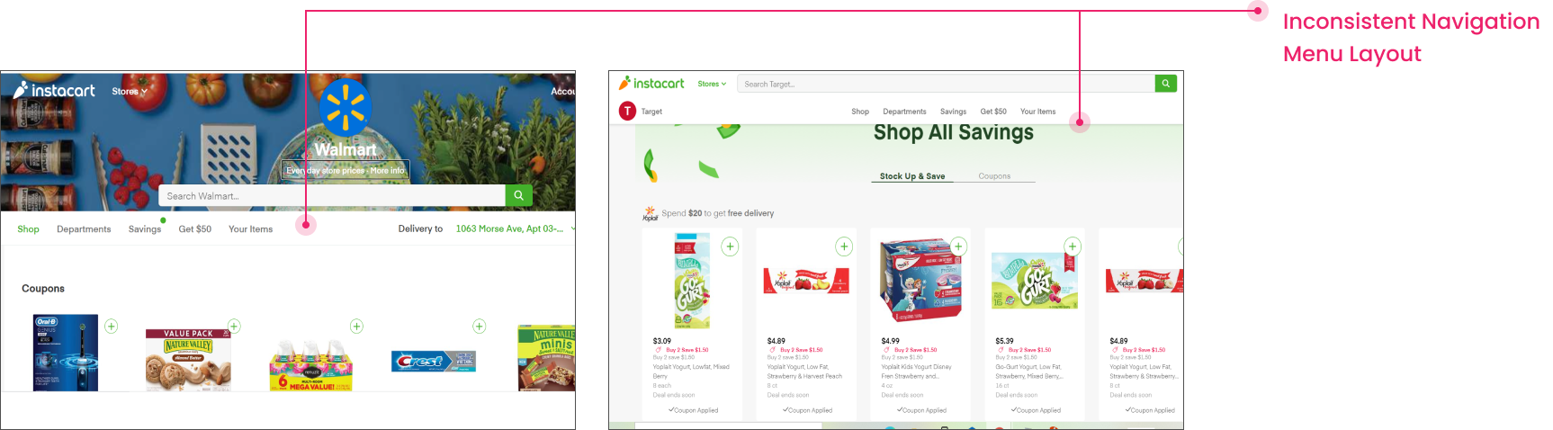
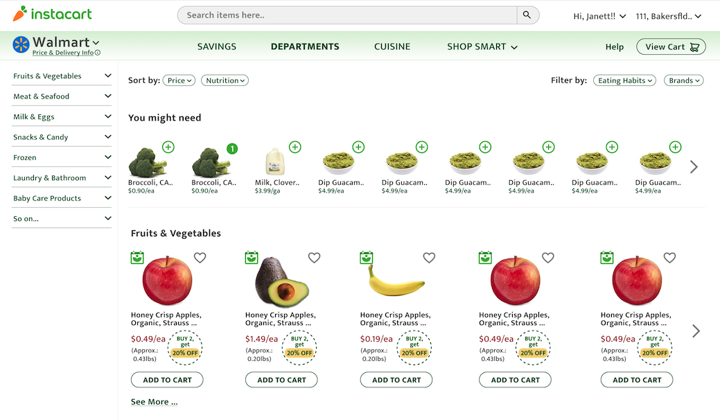
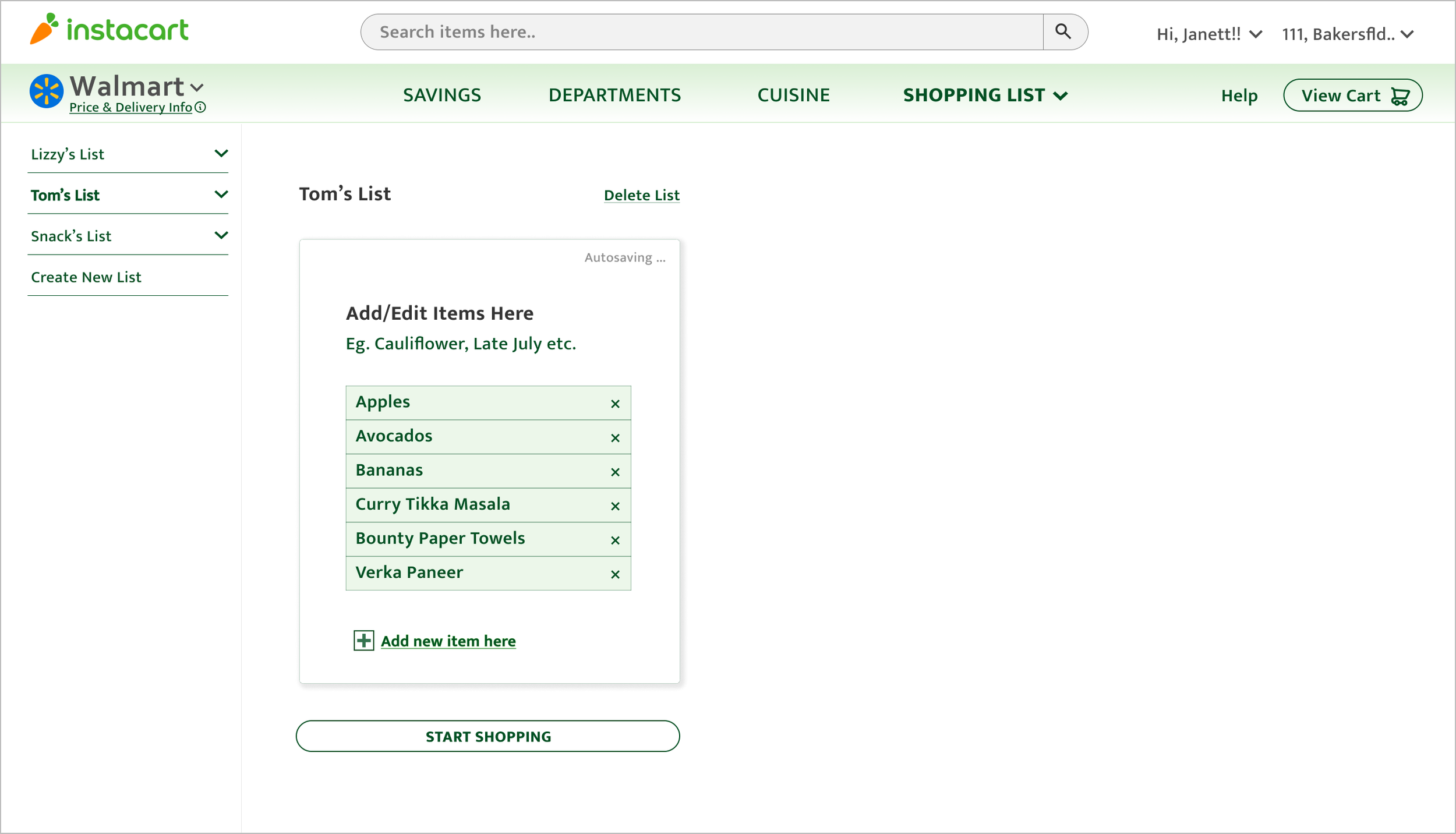
Original Website
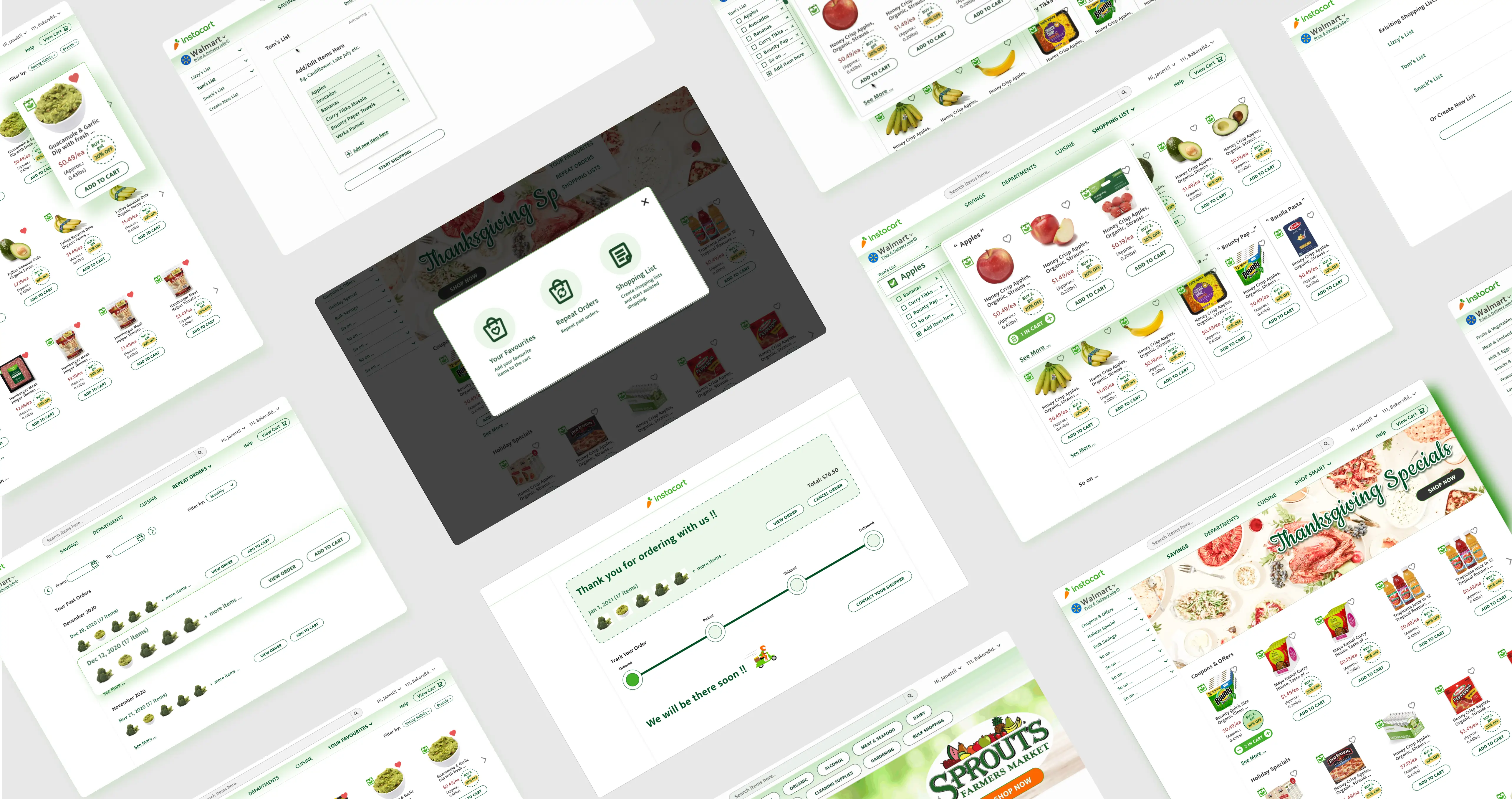
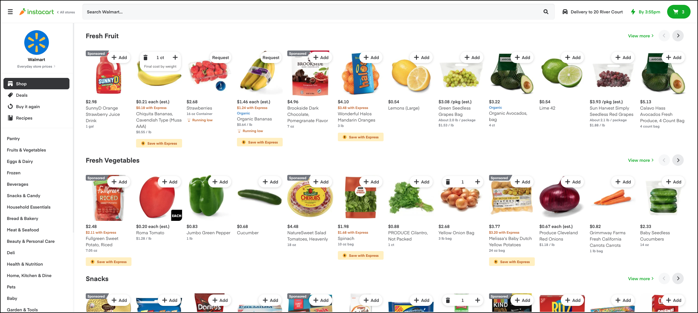
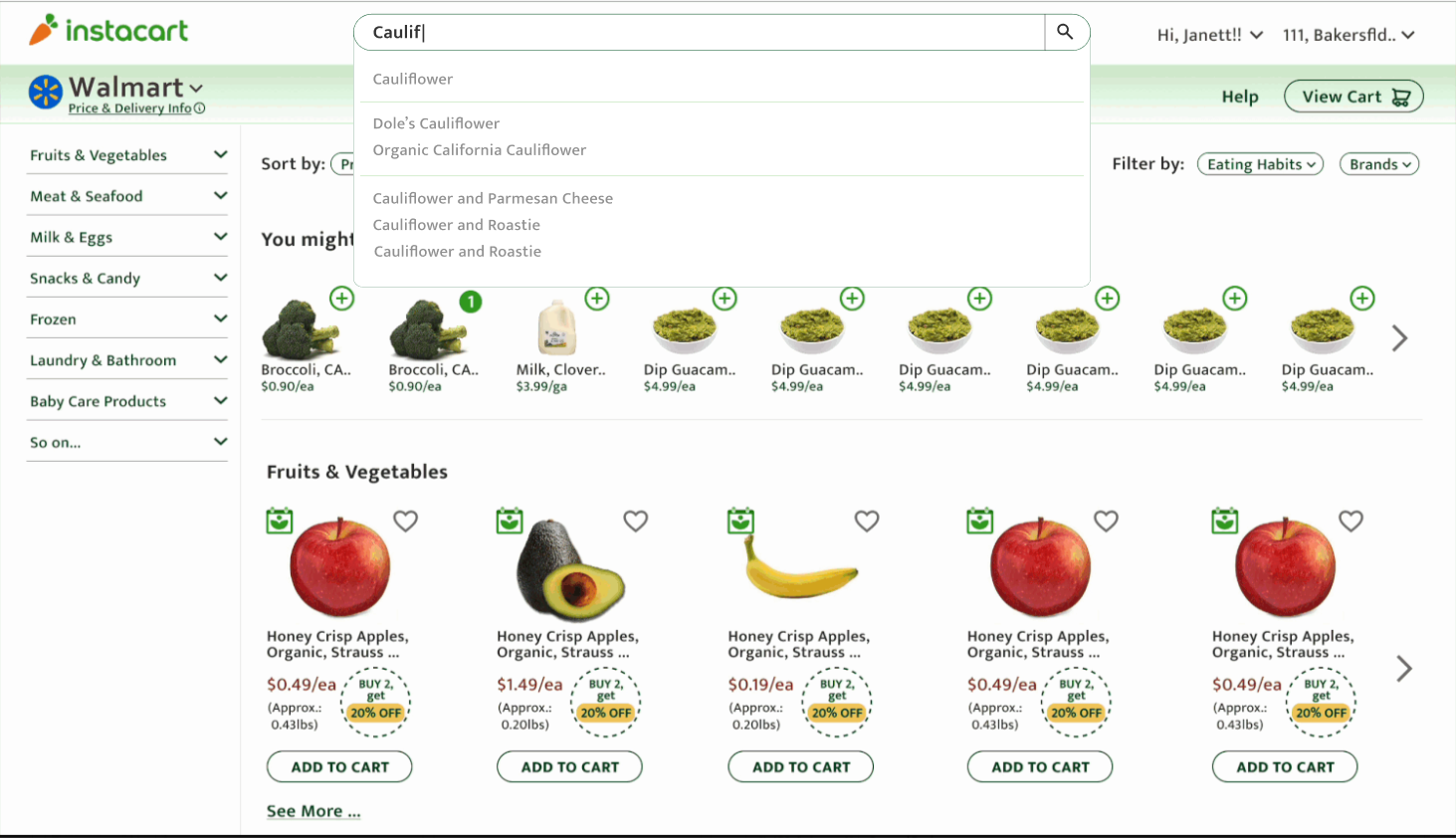
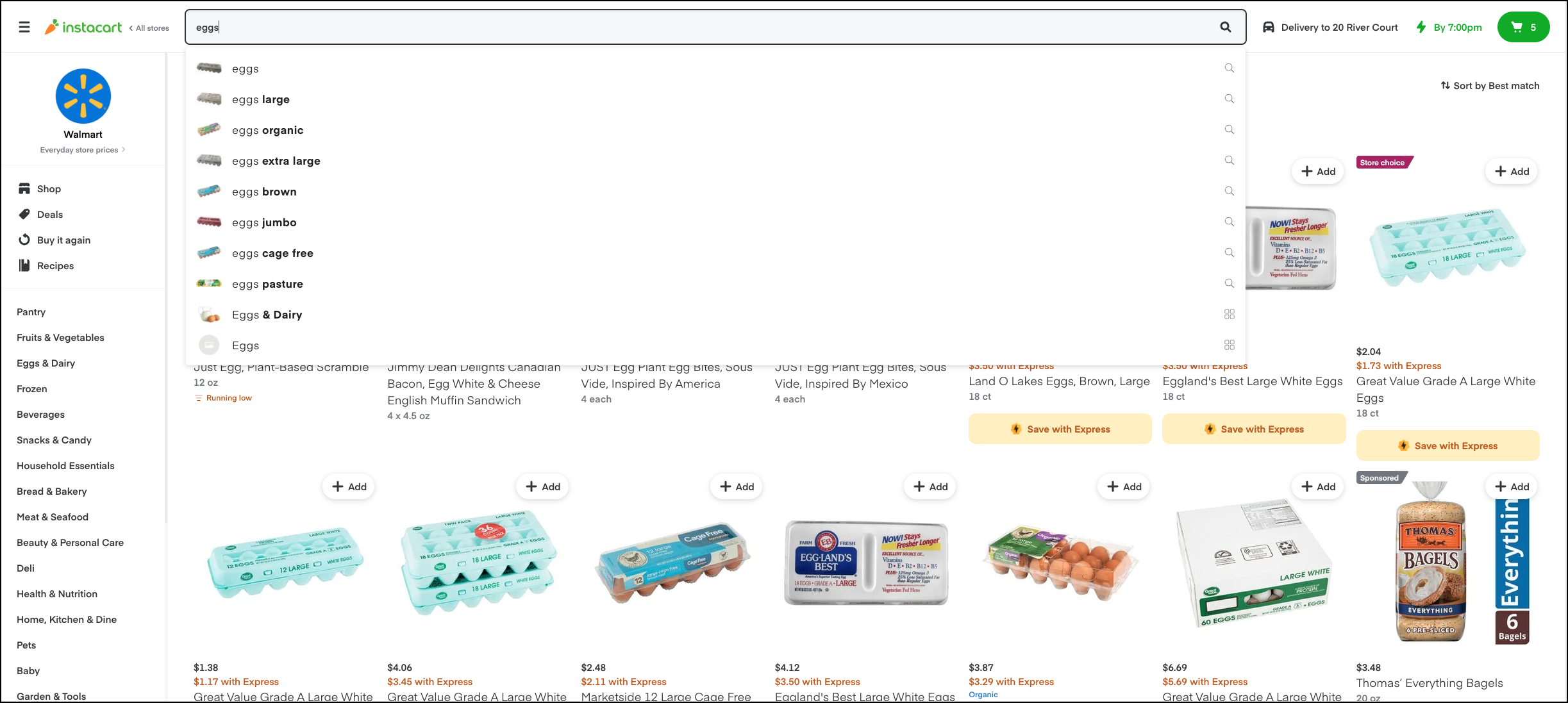
Redesigned Website
My Contribution
The Outcome
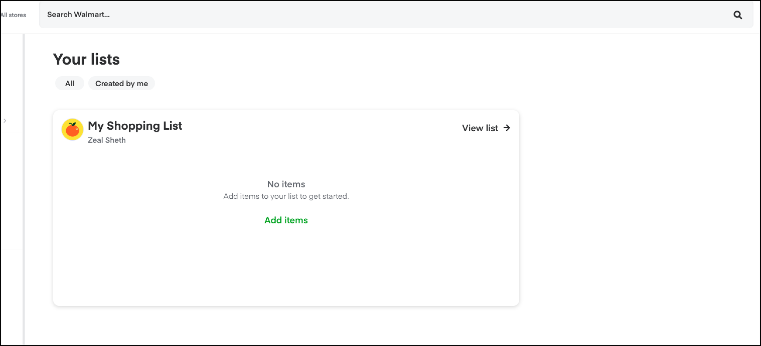
Instacart did redesign its website over next 10 months (in Jan 2022), I was amazed to see it had implemented features similar to my redesign like Optimized Search, Shopping lists, Homepage redesign for better filtering, validating my hypothesis and design process.
The Problem
"How might we help users shop groceries online on Instacart website more intuitively and faster?"
Based on the research insights, I found the current state of Instacart website product browsing page is confusing and non-intuitive, Key User Painpoints,
Design Process
1. Low Fidelity Wireframes
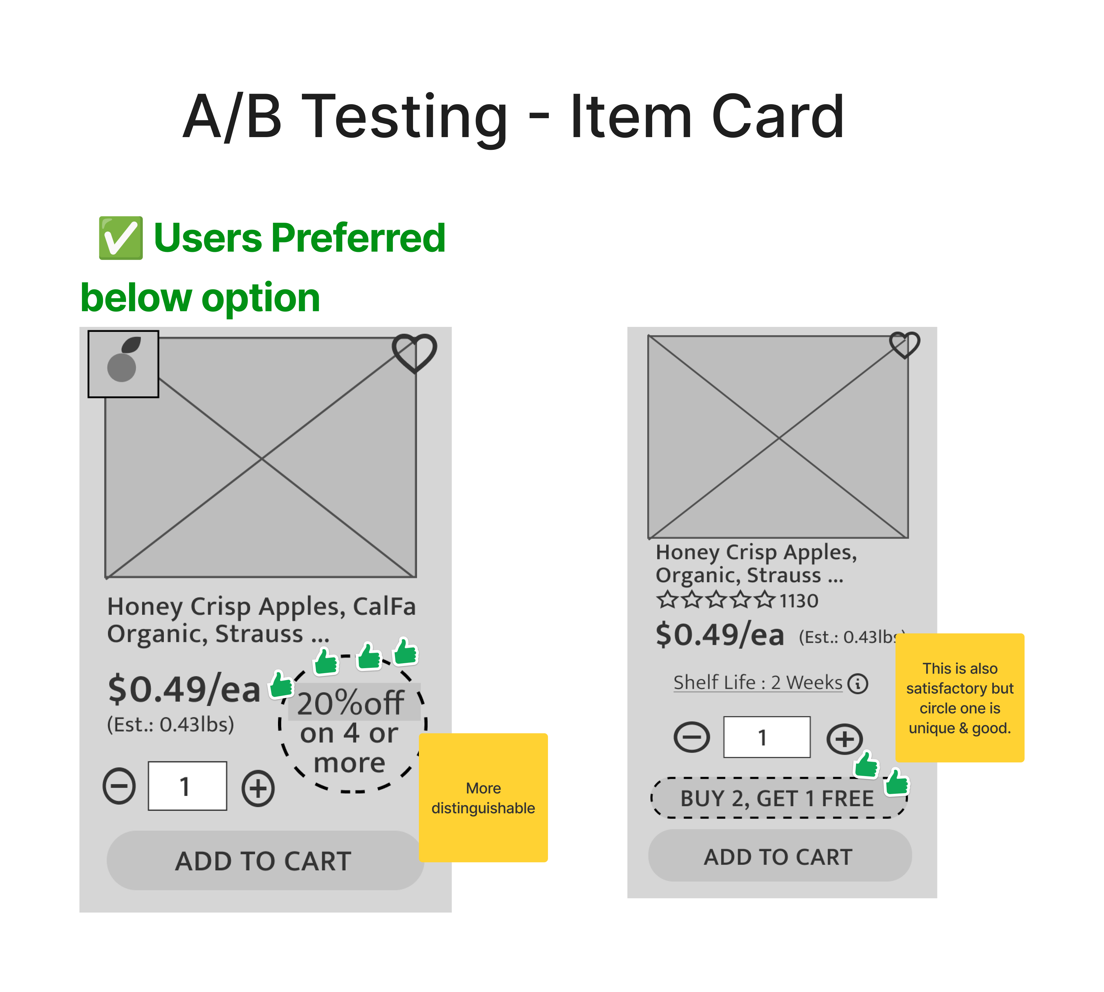
2. Usability Testing - A/B Testing
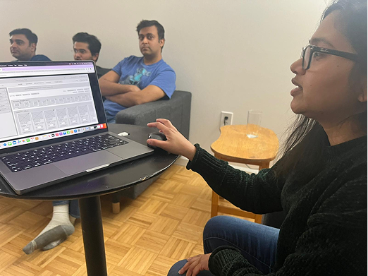
I conducted A/B testing on the low-fidelity wireframes to gather feedback from users and identify areas for improvement.
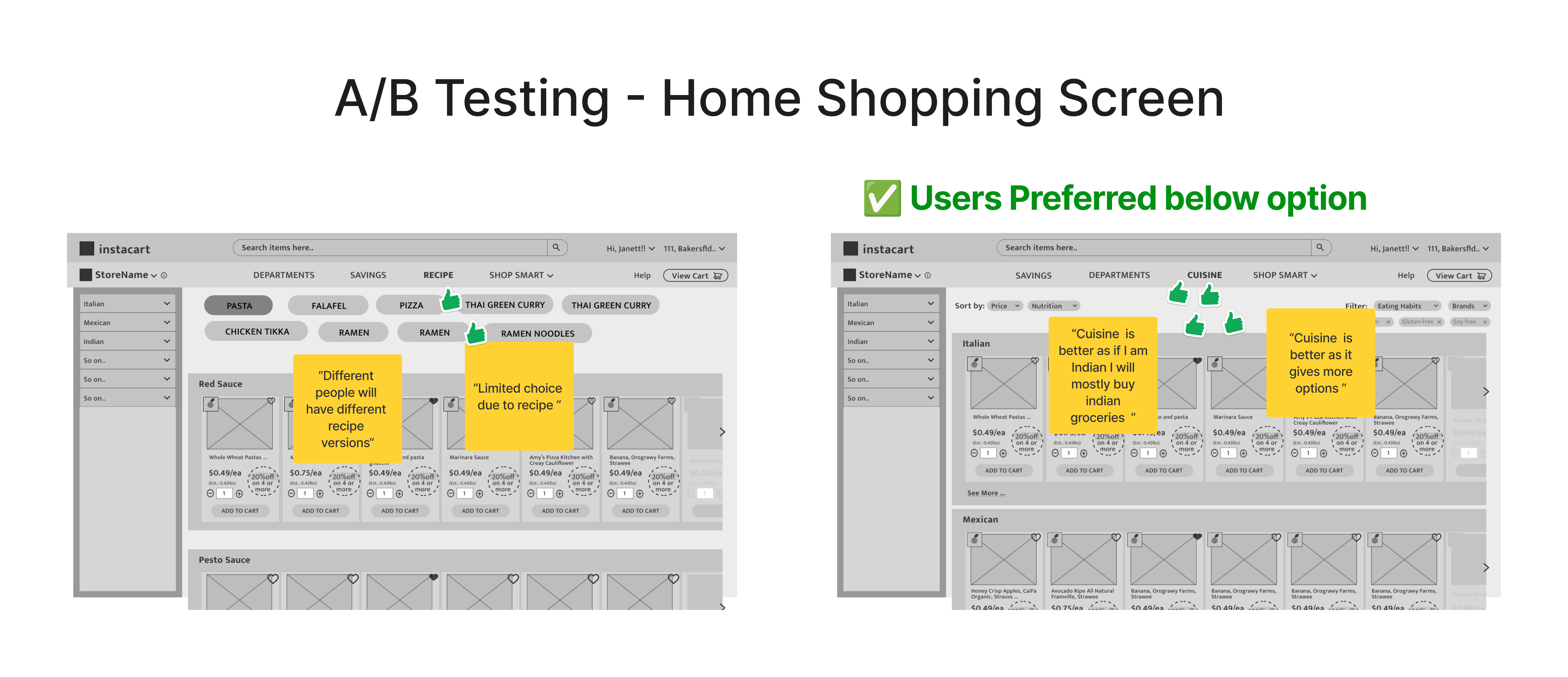
- ‘Shop by Cuisine’ & ‘Optimized Search’ was found useful.
- ‘Savings’ Page is the most visited page.
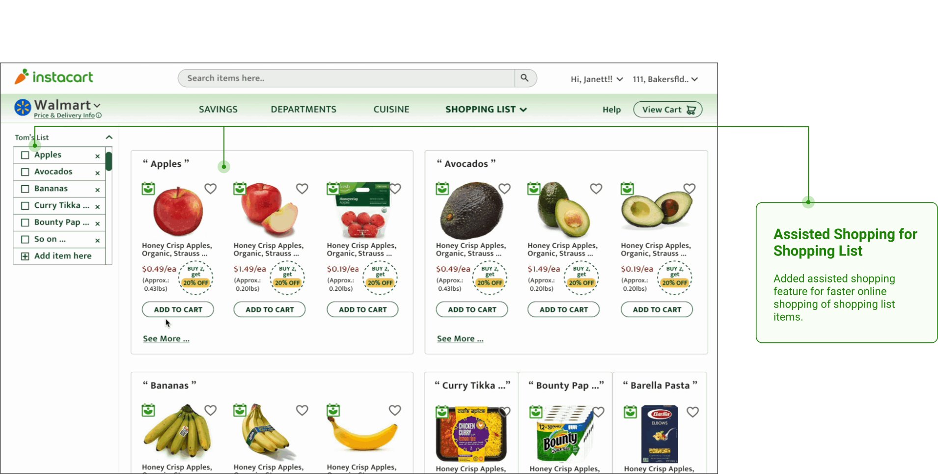
- Two columns for shopping list was found confusing.
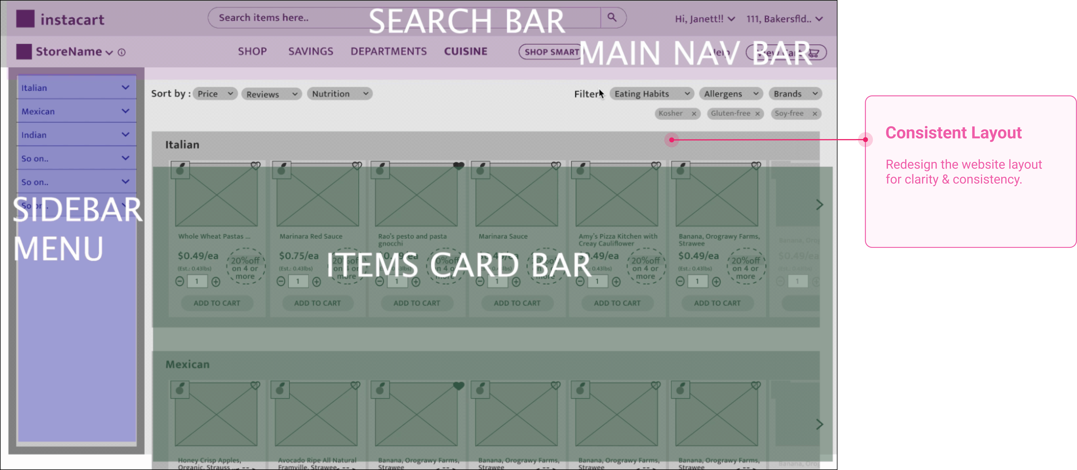
The Solution
After multiple design iterations and user feedback, I designed the final solution for the product browsing page layout and ‘ShopSmart‘ feature to improve user journey.
High Fidelity Wireframes
Success Validation: Instacart’s New Design Implementation (Jan 2022) was similar to My Design Solution 🙌 🙌 🙌
Impact & Learnings
Expected outcome: Increase in the customer (employers) conversion rate because of step-by-step onboarding, clarity in terminology and displaying performance statistics on website to persuade, reduced number of clicks to find active candidates.
My Learnings: Users rely on ‘Search‘ button much more than Navigation. New features can be successfully implemented only if they have familiarity less cognitive effort.